

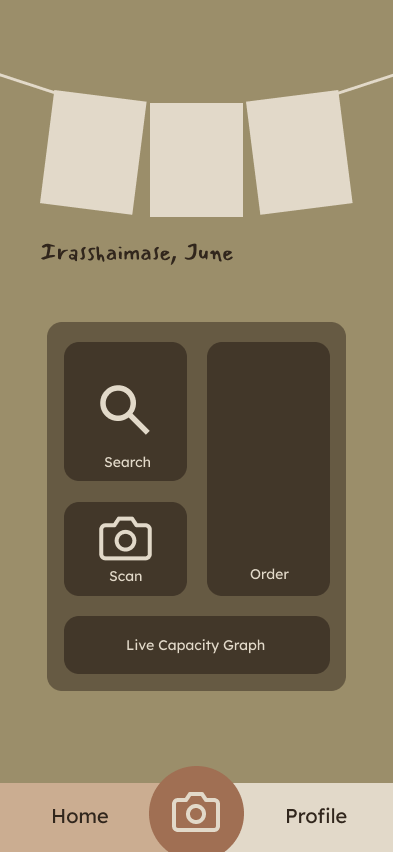
Maruichi Select
Reducing wait times and language barriers for in-store grocery shoppers
Role: UI/UX Designer
Timeline: Fall 25 (15 weeks)
Tools: User research, interviews, wireframing, Figma, prototyping
Context: Academic project
Platform: Mobile app

The Problem
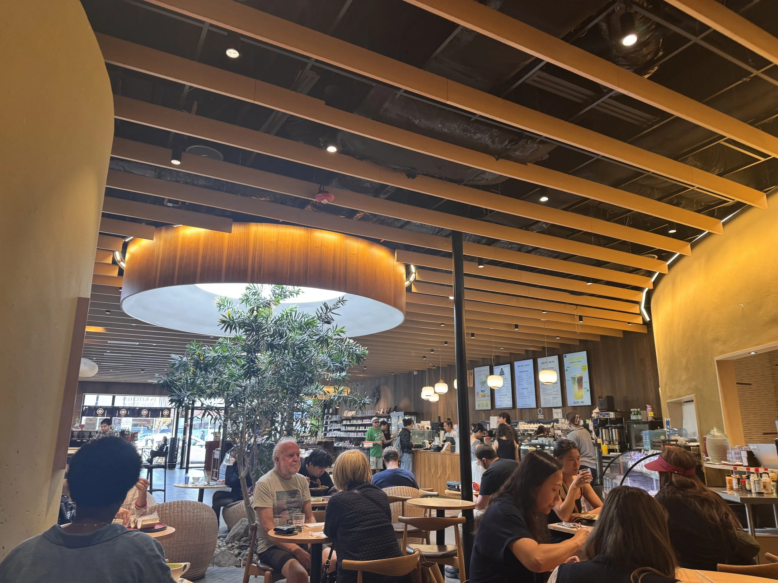
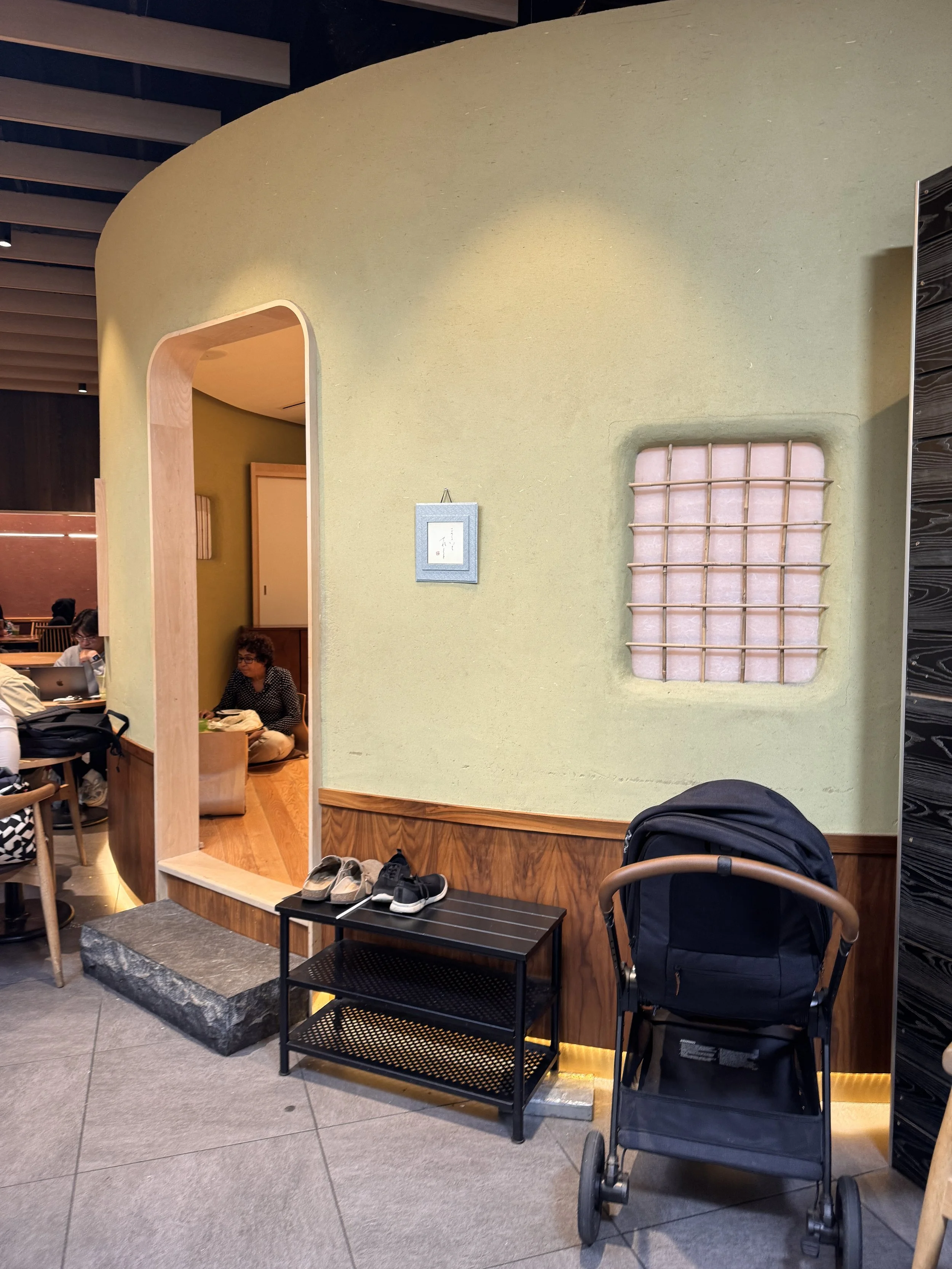
Maruichi Select is a busy Japanese cafe, restaurant, and grocery store in Brookline. During peak hours, customers face long lines, unclear store capacity, language barriers, and difficulty navigating unfamiliar products. These frictions discourage purchases and slow store operations, making exploration feel intimidating rather than inviting.
“The long line discouraged me from getting more when I got hungry after a while.”
-Interviewee S
“I would use [ordering on phone] because it avoids the line.”
-Interviewee R
The Goal
Design a mobile experience that helps shoppers browse, order, and understand store conditions before and during their visit.
Understanding the Store Experience
Key Insights
From street interviews, formal interviews, and on-site observations, several patterns emerged:
Customers enjoy Maruichi’s ambiance but feel overwhelmed when it becomes crowded
Long ordering lines discourage repeat purchases during extended visits
Non-Japanese customers want more context and translation when browsing packaged items
Cultural authenticity is a major reason people return, even when the space is busy
These insights guided design decisions focused on efficiency, clarity, and cultural accessibility.
User Needs & Constraints
As a <Role>
Regular Customer
Grocery Shopper (Non-Japanese)
I want to <Task>
Efficiently order my usual order
See how crowded the store is before I get there
Translate Japanese packaging
Learn more about what is in front of me
Get in line for efficient check-out
Save and remember things I previously liked and want to try
Methods used: On-site observation, interviews, insight synthesis, ideation, wireframing, and prototyping
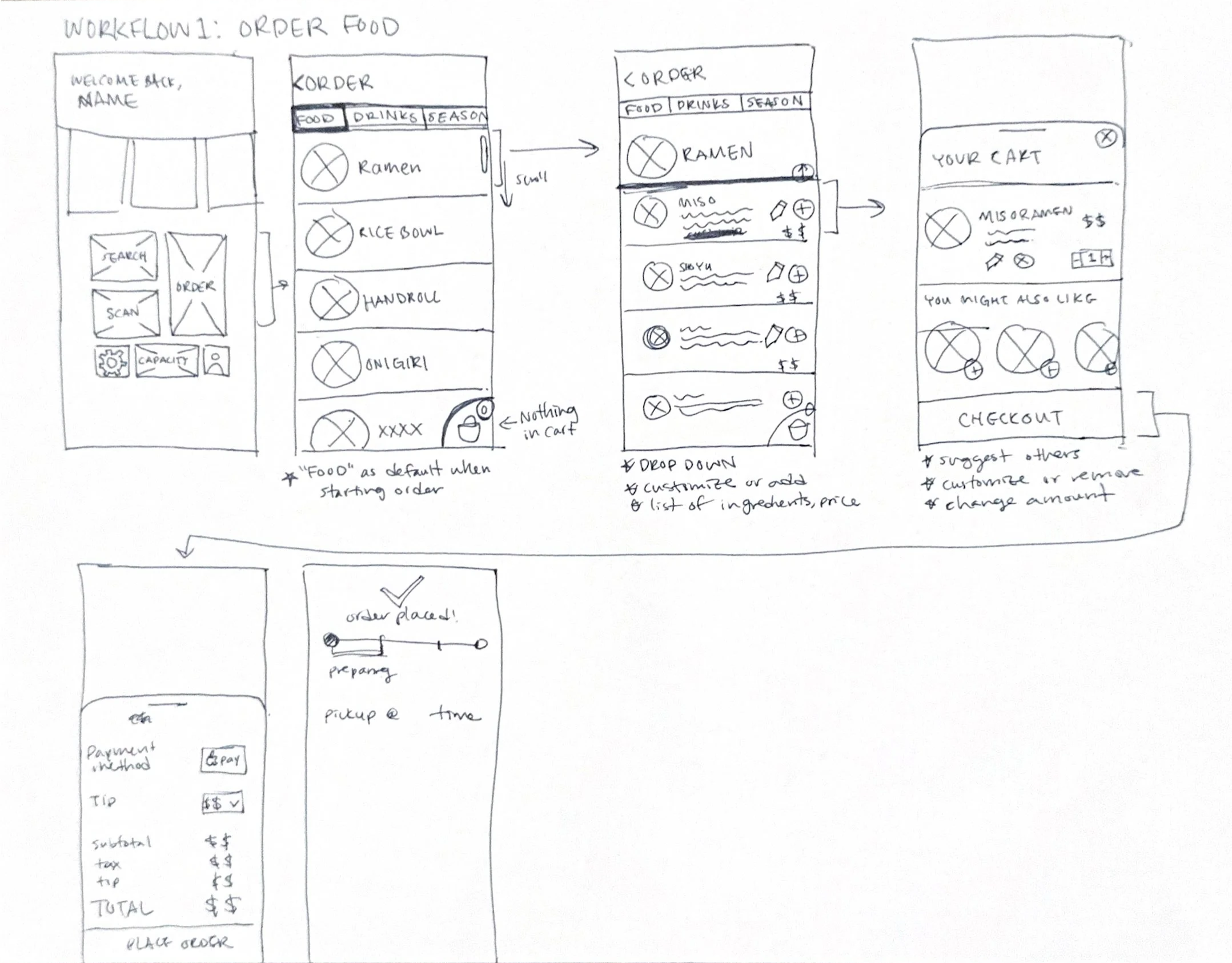
Early concepts & Wireframes
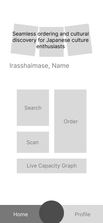
I started with low-fidelity wireframes to test whether users could understand the store’s capacity and ordering options without relying on visual polish. I explored multiple ordering flows and ways of surfacing store capacity in low-fidelity wireframes before committing to a final UI. Early feedback showed that the primary goal of users is to complete their order efficiently, which led me to surface the order option at the highest hierarchy.
3 initial home-screens
My choice: Bento-style layout that aligns with Maruichi Select’s clean, elevated atmosphere.
Low-Fidelity Wireframes
Final Design
I designed a mobile app that enhances the in-store experience without disrupting Maruichi Select’s cozy atmosphere. The app focuses on three core features that address crowding, navigation, and cultural exploration.
User Scenario
Helen, a frequent Maruichi customer, wants to share the experience with her non-Japanese friend. Before visiting, she checks the app’s live capacity to avoid peak hours. Before sitting down, they place their food order through the app. They utilize the translation scanner to explore grocery items together, allowing them to enjoy the space comfortably without navigating long lines or confusion.
Reflection
This project helped me strengthen my ability to translate observational research into clear interface decisions. Through interviews and iteration, I learned how to design efficient interactions while preserving the character and ambiance of the space. It also reinforced the importance of designing with cultural context in mind, especially when creating inclusive experiences for a diverse user base.
So I can <Goal>
Skip waiting in line for a long time
Ensure I will have a comfortable seat
Avoid waiting in line with others
Be confident in what I’m buying
Learn about the items without searching up individual items on google
Avoid waiting in line with others ordering food
Make shopping more efficient when I already know what I want/like
Primary Workflows
Priority
High
High
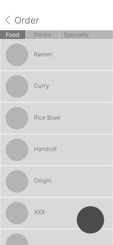
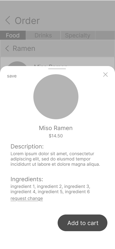
01.In-App Ordering
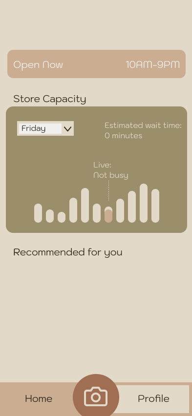
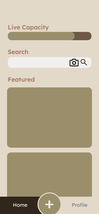
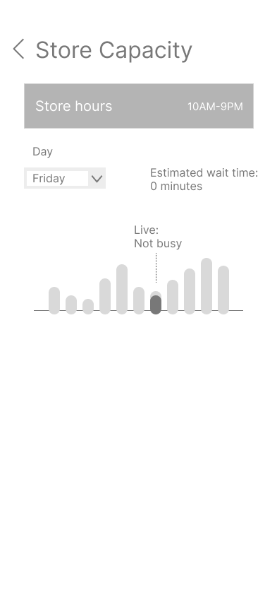
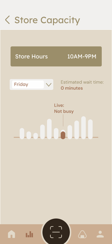
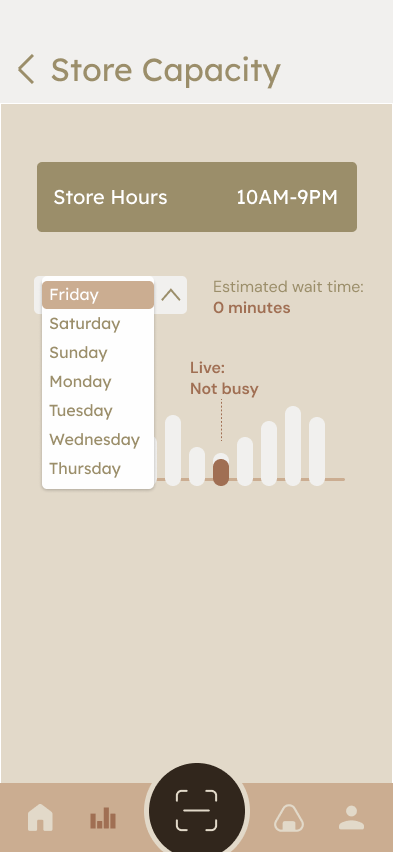
02. Live Store Capacity Graph
Try Prototype —>
03. Translation & Exploration Scanner
Prototype Screencaps(selected)
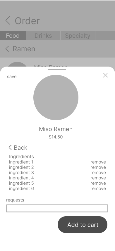
Allows customers to browse the menu and place orders directly from their phone while seated.
Reduces physical crowding near the counter and allows customers to order at their own pace.
01.In-App Ordering
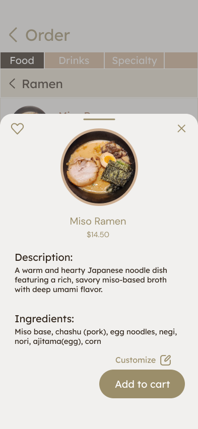
<WF 1.2>
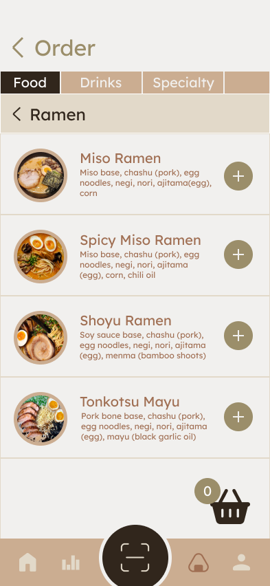
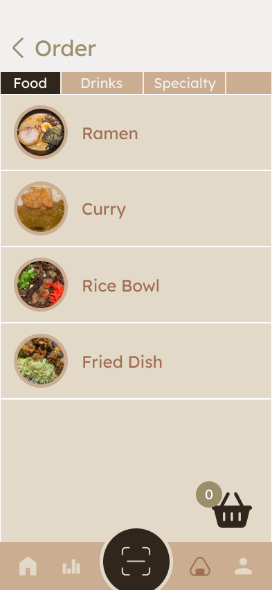
<Select Category or item (Ramen)>
<WF 1.3>
<Search for specific item (Miso Ramen)>
<WF 1.9>
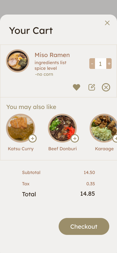
<Review cart>
<Click on Checkout>
<WF 1.6>
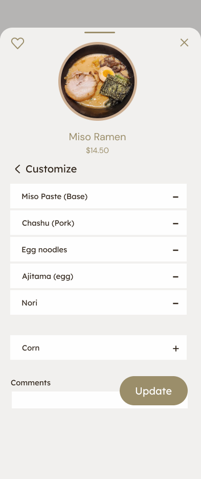
<Click on update to save order customization>
<WF 1.4>
<Click on customize>
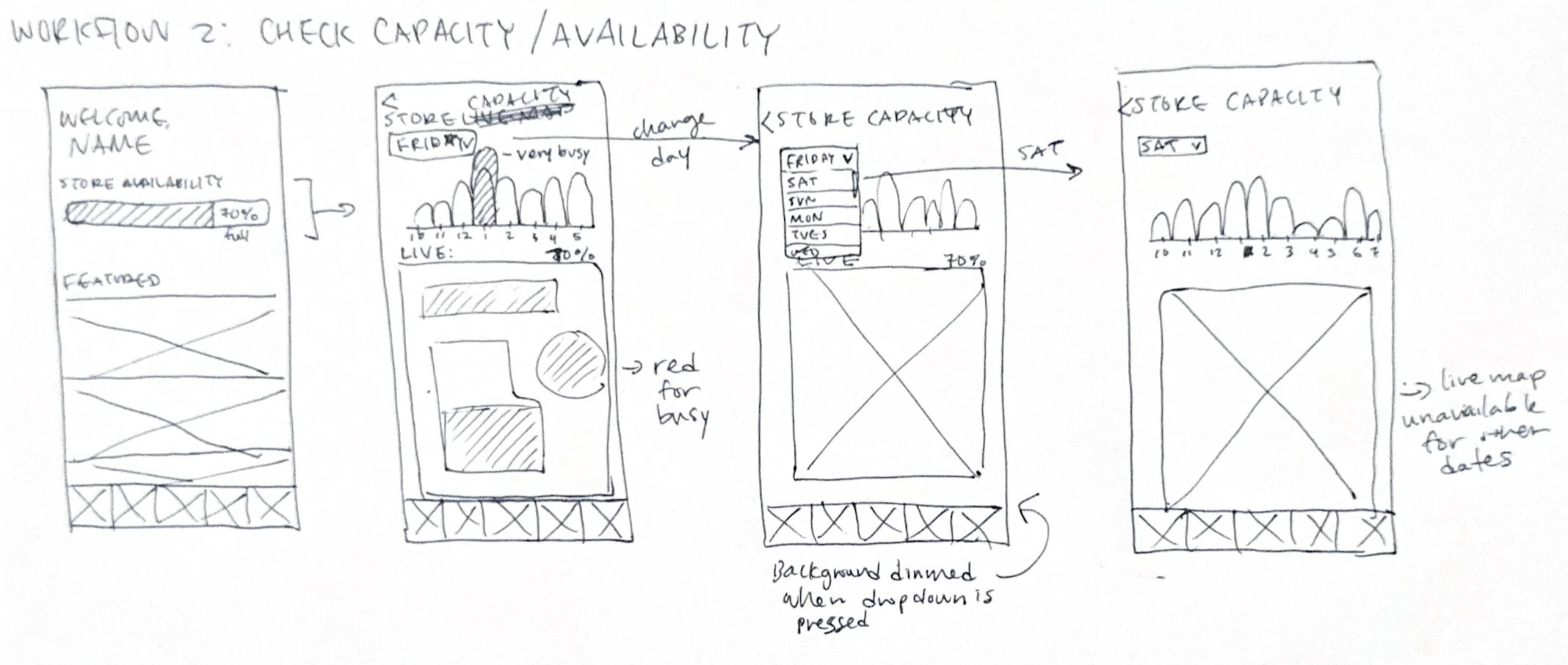
02. Live Store Capacity Graph
A simple live capacity graph showing how busy the space is throughout the day.
Helps users choose less crowded times to visit and sets clearer expectations before arriving.
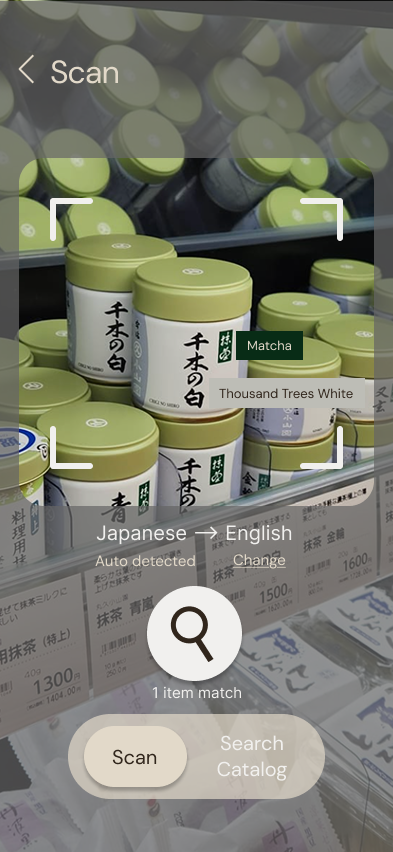
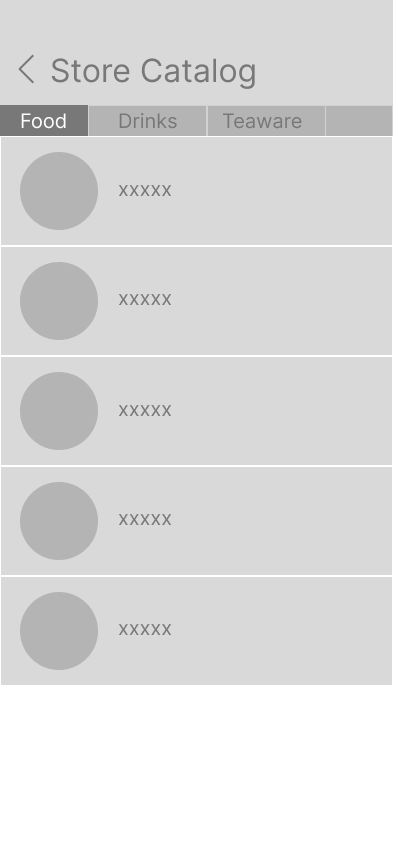
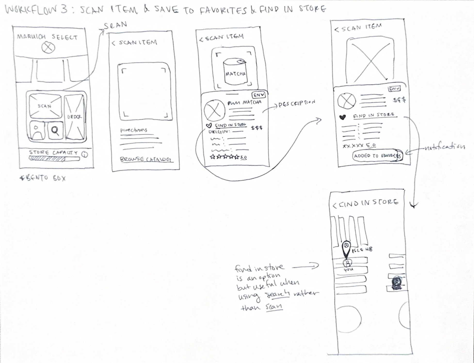
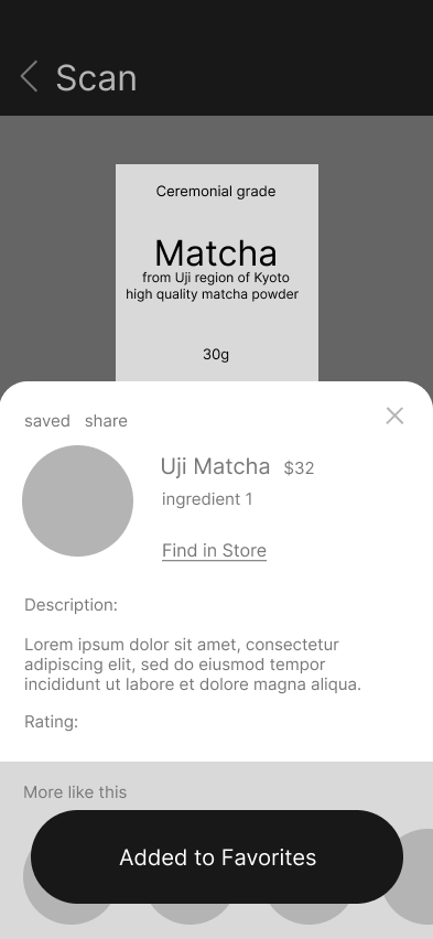
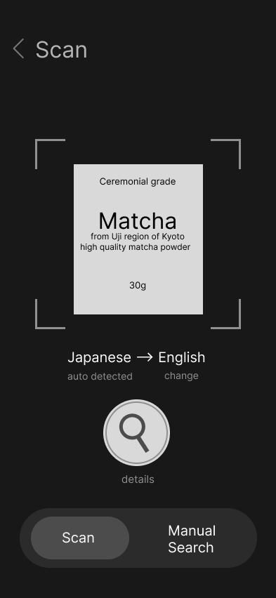
A scanner that translates packaging and provides additional information such as ingredients, usage, and cultural notes.
Encourages exploration while making the shopping experience more inclusive and educational.
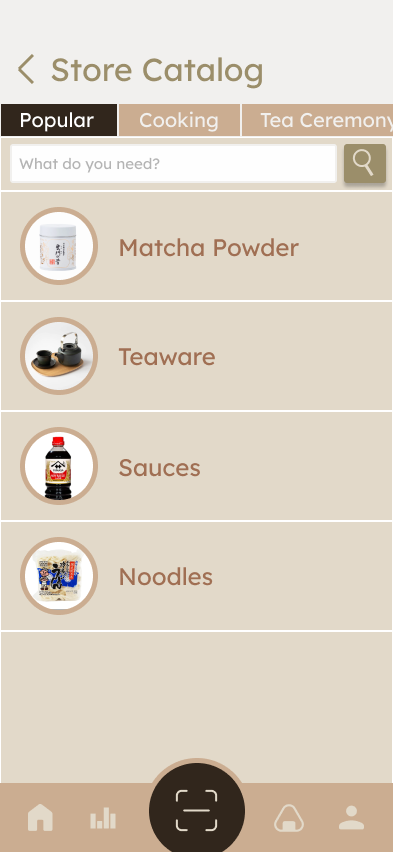
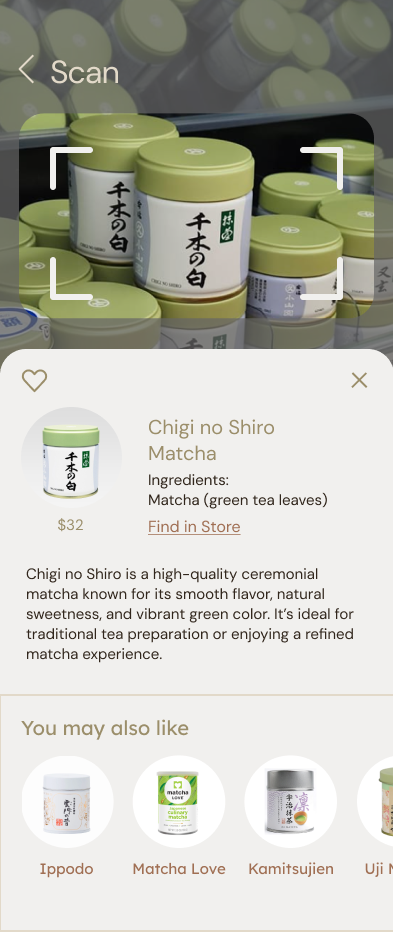
03. Translation & Exploration Scanner
<WF 2.1>
<View live graph for today(Friday)>
<Click on friday to change date>
<WF 2.2>
<Click on day for estimated capacities>
<WF 3.3>
<Click on Heart to save, read info>
<go back and click on catalog>
<WF 3.4>
<Browse catalog for all items sold in store>
<WF 3.2>
<Read translation>
<click on search for more info>